Before we can discuss Wix UX (user experience), we need to distinguish between UX and UI (user interface) since many people confuse these two concepts. The modern trend to shorten everything to acronyms or just a few capitals also doesn't help to clarify the underlying meaning.
Take the replacement of Twitter with X, for instance. Which name is more meaningful and easily understandable?
Understanding UX and UI
UX stands for user experience and UI stands for user interface. Already, written out like that, you get a better idea of the two concepts.
User experience is literally how users experience your website. Great user experience answers questions like these in the affirmative:
- Is the website easy to navigate? Yes.
- Does it load fast? Yes.
- Is it easy to find what you're looking for? Yes.
- Is it simple and easy to pay for your purchases? Yes.
- Is there on-site help to answer my questions? Yes.
In other words, a website that is easy to use has good UX design.
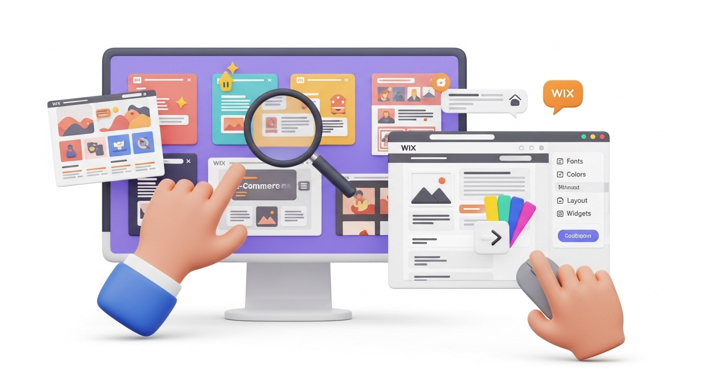
User interface, on the other hand, deals with the look and feel of a website, including the look and feel of the controls they use to interact with the website. UI encompasses the website color scheme, the fonts, and the layout of the website, as well as the buttons and animations users interact with.
As you can see, UX and UI design are closely related and cannot be separated. A neat way to understand the relationship between UX and UX is to think about the website design process. The UX designer creates the overall experience; the UI designer creates the details of the experience. Ultimately, both contribute to what builds a perfect shopping cart.
Put another way: strong UX will lure visitors to your website; strong UX will keep them there.
In terms of UI, Wix has a head start. The platform is renowned for hundreds of professionally designed templates that are aesthetically pleasing and customizable. For those considering a move, a Wix migration checklist can provide guidance. If you're exploring other platforms, our Wix to WooCommerce migration guide offers comprehensive steps.
Understanding UX Design
A UX design is built around the intended audience for a website, taking into account their goals, pain points, motivations, and how these can be addressed through specific actions they take on the website.
UX design also strategically incorporates different content aimed at warming and converting leads. This is achieved by presenting all the content in a logical manner that makes finding the right information and knowing what to do next easy. Our CSV migration service ensures all your product data and content is seamlessly transferred.
This is where well-placed and purpose-designed menus, callouts, and CTA buttons come into play.
Ultimately, UX design boils down to delivering the right information at the right time so a visitor moves smoothly through the website and naturally reaches your intended goal for them. For a smoother transition and to validate user flows, consider leveraging a migration preview service. Our migration customization service can help tailor your new platform to meet specific UX needs.
Understanding the Significance of Great Website UX
When visitors to your site have a good user experience your business benefits directly. The top two benefits, apart from increased customer engagement, relate to revenue and ranking.
Direct Impact on the Bottom Line
A website that offers a simple and satisfying experience that converts visitors naturally to leads or to buy a product or service, is one that has:
- Clear menus that are easy to find and have all the needed information
- Properly placed CTA buttons
- An optimized checkout with a range of payment options
- A limited number of steps to purchase
- Shortened and simplified forms
- Optimally-placed and relevant content
- Evidence of reliability, with certificates and testimonials prominently displayed
- A mobile-friendly version
Boost in Search Ranking
Google is very pro positive website interaction. In fact, it's one of the 200+ factors that search engines take into account when ranking websites.
A website that elicits user interaction tells Google that the UX must be good, so it deserves a higher ranking.
Some factors that search engines will take into account for ranking, include how fast the website loads, site dwell times, and whether it's a mobile-friendly, accessible, and secure site.
Understanding Wix UX
In terms of Wix websites, UX refers to the overall experience a user has when interacting with the platform. That includes the customer's experience while browsing the site, choosing and adding items to their cart, using the checkout process, and all interactions that result from the purchase.
Wix is first and foremost a website builder, so Wix UX also refers to its usability for individuals who use it to build their websites. Wix is a very user-friendly website builder, making it possible for almost anyone to be a website designer.
As a website builder, Wix UX is excellent. It simplifies the web design process, enabling individuals and businesses to have an impressive online presence.
For a website built with the Wix website builder platform, Wix UX refers to the usability and overall experience visitors have when interacting with Wix websites.
Common UX Issues in Wix
Slow Loading Speed
Many Wix sites have loading speed issues. In fact, Wix has gained a reputation for having slow websites compared to many other website builders. These performance issues are a common driver for replatforming, and a comprehensive migration checklist can help manage the process. For those aiming for enhanced performance, our Shopify migration service offers a robust alternative.
What is considered a low load time? If your website speed is over two seconds, it is considered slow and Google will penalize your site with a lower ranking. It will also cost you in conversions. Research indicates that even a one-second delay in page load time can lead to a significant drop in conversions.
Complicated or Confusing Navigation
Consumers expect intuitive navigation when they visit a website. They don't want to waste time looking for things. When the next step is unclear, a visitor may get impatient, leave the site and never return.
Annoying Pop-ups
Nothing is more frustrating than a pop-up that suddenly obscures your view when you want to find or read something on a website. Pop-ups are useful for conversions, but they must be timed properly and planned not to obscure too much of a webpage.
Complex checkout processes
Cart abandon rates are extremely high, and one of the main reasons is checkout processes that are too complex or time-consuming. The price you pay for a poorly optimized checkout is a loss of revenue and customer loyalty.
Limited accessibility
Accessibility refers to the ability of all users, including those with disabilities, to navigate and interact with the site. Improving accessibility also improves the usability of your website as it can be accessed and used by more people. For more insights on overall store optimization, refer to our checklist for the perfect shopping cart. Accessibility can be improved when UX designers make the website accessible by keyboard, so users who can’t use a mouse, can also use the website. Designers can also use color contrast, special fonts, and video transcripts for users with hearing problems.
Lack of mobile responsiveness
Most people access the internet via mobile devices, so websites must be optimized to be responsive across devices and screen sizes. Fortunately, the Wix Mobile Editor lets designers work on a mobile version of a website, so this issue should be resolved when website owners start using the mobile editor.
Poorly Planned and Executed CTAs
Have you ever been on a website where you don't know which CTA button to press? Yes, that's damn annoying. Try not to have more than one CTA on a page, and if there is no other option, find a way to differentiate between them so the visitor is clear on what to do next.
10 Most Impactful Tips to Improve the UX of Your Wix Store
Here are some tips to help you create a seamless, pleasant, and efficient user experience through your UX design.
Get Some Help to Inspire You
There is nothing new under the sun, right? We all learn from what we see around us. There are great resources online for UX designers to help them come up with stunning solutions to wow website visitors.
Browse UX research websites for the latest design trends and understand what users want. Also, gather information from your users and incorporate their feedback into your website.
Provide Only the Necessary Information
The modern consumer has a short attention span. That means you need to find a way to present them immediately with the most pertinent information in as few words as possible. This approach is similar to the careful planning required for pre-migration tips, ensuring a smooth transition for your store. For instance, the homepage should only communicate what your business is all about. The rest of the information you are eager to share, is best shared through links to other pages or anchors that take users to the relevant place on the page.
Use Visuals
Research continues to indicate that web pages with great images can get significantly more views than pages with only text. A large majority of consumers say high-quality images influence their online purchase decision, often more so than reviews and ratings.
It's best to use your own images and not generic or stock images. Studies have found that replacing stock photos with authentic products or services images can significantly increase conversion rate, and using human photos can increase the impression of trustworthiness.
Use Text Wisely
Don't overwhelm your site visitors with too much text. Few of us enjoy a wall of text – it just seems like a job to get through. Use bullet points to segment your information to make it easy for visitors to scan and absorb.
In addition, leverage the power of white spaces. White space on a page allows important information to stand out and prevents visitors from feeling overwhelmed. In fact, research has shown that comprehension increases when information is presented in short concise text surrounded by white space.
Make Navigation a Priority
It must be logical and straightforward to navigate your website. You don't want your visitors to be overwhelmed and leave in frustration. Make sure your website has a well-defined structure that makes navigating it a cinch. For successful platform transitions, consider how to preserve relations between entities during migration.
For instance, it's logical to allow users to access the most important areas of your site from anywhere on the site through just one click. Investigate the different navigation styles to know which one will be the easiest for your users. You can implement some or a combination of the following:
- Horizontal Navigation Bar
- Dropdown Navigation Menu
- Hamburger Navigation Menu
- Vertical Sidebar Navigation Menu
- Footer Navigation Menu
Smooth navigation is one of the most crucial elements of a website because it affects brand perception, customer loyalty, lead generation, and ultimately, revenue.
Minimize 404s
After slow loading times, 404 error pages or page not found errors are the most frustrating for website visitors because it wastes their time and interrupts their site visit.
Encountering 404s is not a user-friendly experience; it is highly disruptive and annoying. It is worth using Google Webmaster or other online tools to check for 404s and fix them. If there are error pages that you have not fixed yet, at least have them display relevant links and context so your visitors don't leave your website. Implementing proper 301 redirects, a key feature in successful SEO migration, is crucial for preserving link equity and user experience during a platform switch.
Keep in mind that search engine crawlers don't like broken pages. Leaving them unfixed will decrease your website ranking, which is why it's crucial to migrate SEO URLs correctly during a platform change.
Also, remember that when users encounter error pages, it affects the credibility and trustworthiness of your site.
Implement a search bar
Typing a search term into a search bar is the quickest way to find information on the web. It's the same for websites, especially large ones. Incorporate a search bar in your website to facilitate product discovery.
An integrated search function allows users to quickly find the information, products, or services they need. It saves them time and effort, which excellent for good user experience.
If you have a large and complex website with many offerings, it's worth investing in an integrated search function so visitors to your site don't need to sift through menus and categories to find what they are looking for. For complex migrations involving extensive data, our ultimate data migration service offers comprehensive support.
An integrated search function improves user experience and customer satisfaction.
Keep the most important information above the fold
Above the fold refers to the days of print media when the most important news was printed above the fold – that is at the top of the page above the fold. People used to read the newspaper folded in half, and the top part, above the fold, contained the most salient news.
Keep your most important news also above the virtual fold of your website, where people naturally engage with content.
Note where and how you place your CTAs
These three letters stand for Call to Action and they tell your visitors what to do next, such as sign up for a newsletter, fill in a form for billing, or make a payment. These buttons must be carefully designed and strategically placed.
For the best user experience, each CTA should consist of 2 – 3 words that tell your viewers exactly what to do next. Each one is best placed towards the bottom or to the right of the content. Surround your CTAs with plenty of white space so they stand out.
When you place your CTAs, plan to have social proof like testimonials right there as well. Social Proof is a powerful sales tool. Studies have found that most consumers read multiple reviews before making a purchase. Learning that someone else has bought something you consider buying is a huge confidence booster. It's important to consider how you migrate reviews when moving to a new platform. Testimonials are so powerful that they can significantly increase conversions.
Leverage Customer Feedback
The best way to ensure that your visitors and customers are satisfied with your website, is to ask them – to conduct some good old-fashioned market research.
For this, you don't need to ply the streets; you can get feedback from your users right on your website. Simply have a survey on your site that asks customers to rate their experience.
Examples of survey questions to gauge customer experience satisfaction:
- Was our website easy to navigate?
- Did our website load quickly?
- How easy was it to find the information you needed?
- To what extent are you satisfied with the content of the website?
- Did we meet your expectations?
- What can we do to enhance your experience?
- Are you likely to visit our website again?
If you get a good response rate, you will have enough information to help you improve your website to guarantee optimal user experience. Don't miss out on this opportunity.
User feedback is crucial to creating a product or service that people love. This fact applies to websites as well. If you want users to keep returning to your website, you need to ensure that it's an experience they want to repeat.
FAQs
How can I improve my Wix site performance?
You can improve your Wix website by focusing on UX and UI. A Website that is visually appealing and easy to navigate is sure to be popular with your user base and may even increase it.
How do I make my Wix website popular?
You can increase your website's popularity by providing the best possible user experience. Make it easy for users to navigate your website and find what they need. Offer ways for them to contact you and provide top-notch customer service.
Why is Wix bad for SEO?
Wix is notoriously slow to load and search engines penalize slow-loading websites. Make sure your website loads under in 2 seconds.
If you want to migrate your website to Wix, you can use Cart2Cart, a SaaS service that allows you to transfer your database, data, and settings to a new platform with ease and security. You can also try a free demo migration to see how it works for you.
Monthly Update – March 2026
In March 2026, the forefront of Wix UX optimization continues to be driven by intelligent, adaptive design. A key trend to watch is the integration of predictive analytics and machine learning to anticipate user needs, offering truly personalized experiences beyond basic recommendations. This includes dynamic content adjustments based on real-time behavior, even predicting potential roadblocks and offering proactive assistance or tailored pathways. Voice user interfaces (VUIs) are also gaining traction; ensuring your Wix site is optimized for voice search and interaction can open new accessibility avenues and enhance convenience for mobile users. Furthermore, consider enhancing emotional design elements, using subtle animations, thematic sound cues, or even haptic feedback (for compatible devices) to create a more immersive and delightful browsing journey. These advanced considerations move beyond mere usability to foster deep engagement and brand loyalty, transforming how users interact with your digital storefront and ultimately boosting conversion rates in an increasingly competitive landscape.
For more details, explore our FAQ section or schedule a call with a migration expert.


