
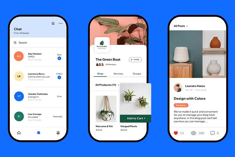
Wix optimization for mobile optimization is the process of making sure that mobile users can access your Wix website content in a way that guarantees a user-friendly experience. For potential benefits of optimizing your site, explore what a website migration can offer.
Why is this important?
The reality is that while many people don't have a computer or a laptop, most do have mobile devices like mobile phones and tablets. And they use these devices to search the internet and shop online.
According to statistics compiled by Hubspot, a significant majority of consumers regularly use mobile phones to shop online, and many smartphone users prefer to shop from a website on mobile because they don't want to download a mobile app.
In addition, mobile internet use keeps rising. According to Statista, mobile devices account for over 60% of web traffic globally. As of early 2026, mobile devices (excluding tablets) generated over 60% of global website traffic.
With Wix mobile optimization, website owners can ensure that their website content displays correctly on a smaller screen and loads fast, ensuring improved user experience. For a seamless transition, consider reviewing the Wix Migration Checklist. For comprehensive planning, explore our Universal eCommerce Migration Checklist.
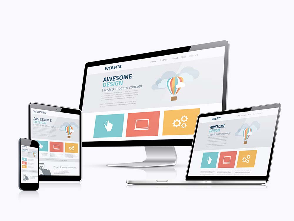
Mobile optimization incorporates the implementation of responsive design so the layout and formatting of a website display correctly on a small screen. It involves a range of other tactics we'll discuss in this article.
Mobile optimization is not a nice to have; it is essential for businesses and organizations as a large proportion of their users are mostly on mobile, contributing to what builds a perfect shopping cart. For a complete strategy, refer to our roadmap for successful e-commerce re-platforming.
Benefits of Mobile-Optimized Wix Stores
There are many benefits to optimizing your Wix website for mobile.
Improved user experience
When you invest in mobile optimization, the user experience for your customers and visitors is improved, which helps with traffic and return traffic, creating opportunities for you to generate revenue. Optimizing websites for mobile usage involves technical work to ensure faster page load time, which is a major factor in user satisfaction. This focus on performance is often a key consideration when reviewing basic data migration services. Prior to any major changes, reviewing pre-migration tips can be highly beneficial.
Aid in conversions
The rate of website conversions stays frustratingly low. Across many industries, including tech, legal, financial, healthcare, and more, the conversion rate typically ranges from 2% to 6%.
For e-commerce businesses, the average conversion rate is also modest, often ranging from 2% to 4%.
Properly implemented optimization, such as making it easy to make a purchase or fill out a contact form, can lead to higher conversion rates. For tailored solutions to boost your store's performance, consider our migration customization service.
Helps to limit cart abandonment
Think for a moment about the typical mobile shopping experience.
You are faced with minuscule buttons, can't see links properly, the forms are awkward to fill in, and you have to scroll back and forth endlessly. The top menu is not clear and you can't find what you're looking for.
When you eventually find what the desired item, you have to manipulate the screen or find a way to see the product in detail. And when you try to compare two similar products, the screen size stymies you.
By the time you get to the checkout, you just want to click once and be done. If there is a form to fill in or some other task to perform before your purchase is done, you might just abandon the whole thing right there.
That's what most people do, and that's what you want to prevent. If your website optimization means your users don't face any of these frustrations, you stand a good chance that shoppers won't abandon their shopping carts. To further secure your migration and minimize risks, exploring migration insurance can be a wise choice. Following post-migration best practices can also ensure a smooth checkout process.
Aids with customer retention
Consumers these days are fickle – they move from one device to another and from one online store to another in the blink of an eye. There is no such thing as consumer loyalty.
You can keep your customers coming back by providing them with a seamless shopping experience between your website and mobile. If your customers can have a frictionless experience between devices, you stand a better chance of retaining them.
Improves ranking on Google
Mobile optimization is excellent for SEO. For years, Google has prioritized websites that are optimized for mobile. This mobile-first indexing approach prioritizes mobile-optimized Wix websites, so they are more likely to rank high in search results. Understanding how to migrate SEO URLs can further enhance your visibility.
Provides a competitive advantage
Businesses and organizations that prioritize mobile optimization can gain a competitive advantage over entities that don't take this step. Wix website owners that provide a seamless mobile experience can differentiate their brand from their competitors, a key reason many choose to migrate to the platform.
Increased website traffic
As soon as your business is also accessible via mobile, you increase the number of people that can find your business and interact with it online. If you don't know how to make Wix mobile friendly, your business risks losing out on potential customers who could have found your website on mobile. Being accessible online and on mobile creates the potential for increased traffic for your business, and ultimately increased business potential. Many businesses find that migrating to Shopify can significantly boost their mobile commerce capabilities.
Ready to Optimize Your Wix Store for Mobile?
Ensure a smooth transition with Cart2Cart! Migrate your store’s data to a mobile-optimized platform seamlessly. Start your hassle-free migration today and reach more customers on the go!
TRY IT FREE
How to Optimize Wix Store for Mobile - 10 Tried & Tested Tips
Wix doesn't offer truly responsive templates for its websites in the traditional sense, relying instead on its dedicated Mobile Editor for adaptation across devices.
A responsive website uses flexible grid layouts, images, and media, which automatically adjust to a smaller screen. However, the Wix CMS uses absolute positioning, which makes it difficult to achieve a responsive design where the layout adapts to different screen sizes. If these limitations lead you to explore other platforms, learn about migrating from Wix to WooCommerce.
Fortunately, there is a workaround to this. Normally, people first develop the desktop version of their website, but Wix also offers a mobile website editor, which allows you to work on your mobile website version so it looks right on smaller screens. This is a unique offering by Wix, which few website builders offer.
So, how do you make sure your Wix site looks good on mobile? Here are a few tips on how to make Wix mobile-friendly.
Use the new Wix Mobile Editor
Wix provides a mobile optimization editor. With this new solution, a mobile version of your website is automatically created. You can use to Mobile Editor to change the design, reduce or hide content, scale and move website features. These actions will leave the desktop version of your website unchanged.
The new Wix mobile editor lets you adjust your site so it's optimized for mobile viewing. To accomplish this, follow these steps:
- Go to your Wix account and go to the website editor.
- The Wix Editor always opens in the Desktop View. You have to switch to the Mobile View. So, once in the editor, find the mobile icon on the top left and click to go to the mobile editor.
- Use the various options in the editor to customize your site for mobile formats. The changes you make here will only affect the appearance of your website on mobile, not on a PC or laptop.
- Once done, go to the Mobile Settings tab and enable Optimized Mobile View.
- Click Preview to see how your site will look on a mobile device.
- Click Publish.
While the Wix Editor allows you to edit your website for mobile, it's not an ideal solution. You still need to edit your auto-generated mobile site to be optimal for human users.
Optimize Your Website's Loading Speed
A fast loading speed is crucial to your business success. Consumers have no patience for websites that load slowly. A slow-loading website can cause visitors to abandon your site and go somewhere else with their business.
Check your website load time using a free online tool and take steps to improve loading time if need be by compressing images and videos, simplifying code, and deploying caching.
Check your website load time using a free online tool and take steps to improve loading time if need be by compressing images and videos, simplifying code, and deploying caching.
Optimize your images
Images can make or break the visual appeal of a website, but their major drawback is that they contribute to slow loading times, which is unacceptable to modern consumers.
You can optimize your images for the web by saving them correctly in terms of file size and format. Consult Wix to know when to choose a PNG over a JPG format.
Before you upload them to your site, remember to optimize your images by compressing them. You can do this with the Wix Editor or a free online tool like kraken.io. What you want is a reduction of the image file sizes while retaining image quality.
Condense your content
Get your message across immediately. For every page of your mobile website, know exactly what you want to achieve and get to the point quickly. Keep it short, simple, and punchy.
Share the most relevant information first so your visitors immediately see the value of your offering.
Break content up into short paragraphs.
Mobile users don't want to be faced with lengthy content. Experts suggest a screen should contain all the necessary information, eliminating the need to keep scrolling down. That boils down to one idea expressed in two to three sentences that don't fill the whole screen – four to five lines, at the most.
Even forms should be shortened. They should require the minimum steps to complete and must be very clear so all the information can be taken in at a glance, much like adhering to a checklist for the perfect shopping cart.
Use a Large and Clean Font
The font you choose for your website is important. It impacts the perception of your brand on mobile, and it has the added need to be legible on a small screen. Considering a platform's design capabilities often comes into play when deciding between custom or pre-made e-commerce templates.
Don't take it for granted that the font size that looks great on a desktop will display the same on mobile. Test the font on mobile to ensure it doesn't look too small on mobile.
It's recommended to use a san- serif font because it is easier to read than serif and script fonts.
Host Your Videos with a Third-Party
High-quality videos enhance the look of your website, increase dwell time, and promote visibility in search results. They are crucial for marketing, considering that visuals are processed up to 600 times faster than text, which means videos are an excellent tool for educating your users.
However, they can also seriously slow down your website. Hosting them on a third-party platform could significantly improve your loading speed, which affects how your website ranks on search engines.
There are a number of platforms where you can host your videos for free, YouTube being one of them.
Remember to optimize your videos by formatting and compressing them so they can be easily viewed and shared.
Adjust your buttons for mobile
Consider that users will use their thumbs to press a button. Just use your phone to access a website, and you will see for yourself where the button should be: top right of the screen. This is where you should put your calls to action (CTAs).
Next, make sure to enlarge your buttons so they are easy to press with a thumb.
Watch where you put your links
This is a similar issue as with buttons. It is difficult to click a link accurately with a thumb on a small screen. Make sure your links are not so close to each other that it's impossible to avoid pressing more than one simultaneously.

Avoid pop-ups
You already have a small screen to work with; why clutter it up with annoying pop-ups? Besides, it's not possible to set a pop-up to appear at certain moments during mobile use. In addition, research has shown that pop-ups are the most hated form of advertisement, so just don't have them.
Avoid cart abandonment with optimized forms
Forms that are difficult and time-consuming to complete, is one of the main reasons for cart abandonment. On a small screen, this is even more likely.
Here are some steps you can take to optimize your forms for mobile.
- Have fewer fields that must be completed.
- Implement auto-fill options so forms are quick to fill in.
- Incorporate clear indicators of omissions or errors on the part of a user so they can make quick corrections.
FAQs
Is Wix optimized for mobile?
No, Wix is not optimized for mobile. Wix websites are responsive, which is not the same as being optimized. Responsive websites adjust to fit the screen size of any device.
How do I optimize my mobile Wix?
You can use the mobile Editor to optimize your Wix website for mobile. It allows you to change the design, reduce or hide content, and scale and move website features. Doing this you can ensure that your site looks good on every device.
Why does my Wix website look bad on mobile?
Wix templates are not optimized for mobile. Wix automatically creates a mobile-friendly site for you from the content and elements on your desktop site. This is not a new site; it's just a different view of the same site, so there may be issues with the layout that make the site look bad on mobile.
How do I make my Wix website look good on my phone?
You can use the new Wix Mobile Editor to rearrange your content so it's optimized for mobile viewing. You can also take steps to optimize elements like site speed, and media, condense your content, and use the right font to create a smooth experience for your site visitors.
Final Thoughts
Wix templates are responsive, but they are not optimized for mobile. To optimize a Wix template for mobile, users must use the Wix Mobile Editor, which allows them to edit their online website for mobile. In addition, there are a number of steps users can take to optimize their websites for mobile.
Do you want to migrate to Wix? Let Cart2Cart do it for you. No matter what store you own and what shopping cart you want to migrate to, Cart2Cart can handle it for you with no fuss and no loss of data. Explore our Ultimate Data Migration Service for comprehensive support.
Monthly Update – March 2026
As we step into March 2026, the focus for Wix mobile optimization is shifting towards hyper-personalization and intelligent search functionalities. Beyond responsive design, store owners should consider leveraging AI-driven tools to offer tailored shopping experiences directly on mobile devices. This involves dynamic product recommendations based on browsing history, personalized landing pages, and even custom notifications that resonate with individual customer preferences. Enhancing mobile search with voice search capabilities and predictive text can dramatically improve discoverability and ease of navigation for users on the go. Think about implementing visual search features where customers can upload an image to find similar products. While Wix's native features continue to evolve, exploring third-party integrations that offer advanced AI and search solutions can give your store a significant edge. Prioritizing these intelligent features ensures that your mobile site isn't just functional, but also smart and highly intuitive, leading to increased engagement and conversion rates in a competitive market.
For more details, explore our FAQ section or schedule a call with a migration expert.

