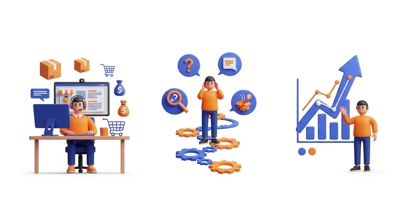
Customers buy your products because they want them. They see their value and recognize the benefits only you provide.
As great as that might be, it’s only one piece of the puzzle. Having a great product is not enough.
You need to make it easy and convenient for people to buy from you. You need to make it pleasant for them so they can keep coming back for more.
That’s what a good user experience (UX) is all about. The longevity of your online store depends on it.
Is your BigCommerce UX doing what it needs to turn clicks into conversions? If your current platform limits your ability to create a superior UX, exploring options for a platform upgrade or migration, like reviewing essential pre-migration tips, could be beneficial.
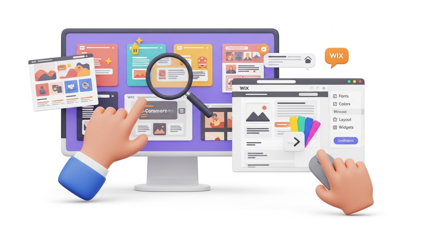
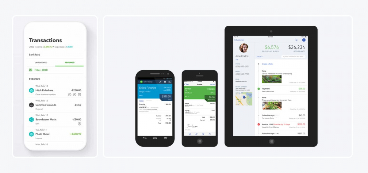
Understanding BigCommerce UX
The idea behind enhancing your BigCommerce UX design is to put yourself in your customers’ shoes and ask, “What will make their shopping experience seamless?”
Keep asking this question over and over when figuring out what kind of perception users have when interacting with your store. Then, take the necessary steps to fine-tune any aspect of your site that could turn them off from shopping there.
Implementing a good UX on your BigCommerce website is a process that requires lots of forethought, testing, and work. Even something as seemingly miniscule as a button out of place or a mistimed pop-up can cause a prospective customer to change their mind about completing their purchase. Ensuring every detail is correctly configured is crucial, similar to how a migration preview service helps verify data accuracy before a full transfer.
Yes, it’s that important.
With that in mind, let’s dive into the three core elements that make up a good UX for eCommerce.
1. Simple Navigation
Once someone gets to your online store, how easily can they find the product they need? Do they have to dig through a sea of menus just to find it? Does your site search engine deliver relevant results?
When a customer is interested in buying something from your store, they should be able to find it in the shortest time possible. Your website's products and categories should have a logical organization to help users narrow their search and find what they want. A well-organized structure is a cornerstone of a perfect shopping cart.
As a rule, customers should use the least number of clicks to find the desired product. The idea is for your customers to enjoy seamless navigation and find what they're looking for quickly and with as few clicks as possible.
2. Fast Transactions
Now that the customer has found what they were looking for, how fast can they check out? Are they required to open an account before they’re allowed to complete their purchase? Will they have to fill out a whole bunch of information that'll take ages to finish?
The checkout process should be fast and easy – one or two clicks, and they're out. Only ask for essential information. We're talking about their name, billing, shipping addresses, and purchasing details. That’s it. Proper data entity preservation is crucial for a smooth transition. For a smooth transition to a new platform where such data is crucial, consider reviewing a universal eCommerce migration checklist. You would be surprised by how fast users get frustrated by long, drawn-out checkout processes. Contemporary studies consistently show that a substantial portion of online shoppers will abandon their carts and turn their attention elsewhere if the checkout process is perceived as lengthy or complicated.
3. Clear Communication
Are you using a lot of jargon in your product descriptions? Do your words clearly and accurately describe the product specifications? Have you incorporated the terms prospective customers use to search for products?
The language you use on your BigCommerce store matters if you want to make successful sales. Understanding how language data is migrated can be crucial. An easy-to-understand site equals a better UX for visitors, contributing to the essence of eCommerce excellence.
Common UX Issues in BigCommerce
Now that you know the essential elements of a good user experience, let's focus on some common BigCommerce UX issues to avoid.
1. Poor Design
If you’re experiencing higher-than-average bounce rates, it might have something to do with your website design. Common BigCommerce design issues that users might find off-putting include:
- A cluttered and complex homepage
- Empty landing pages
- Too many product pages and categories
The design of your eCommerce website should be such that users understand your brand at first glance. They should find what they’re looking for quickly and efficiently without feeling overwhelmed or confused. This often involves careful planning, similar to the considerations for a premium data migration service.
See also: Replatforming vs. Redesign: Which Approach Is Right for Your Business?
2. CTA Button Issues
A Call-to-Action button is a link that tells your customer what to buy, where to go, and how to navigate your store. It steers visitors towards making a purchase. The two most common BigCommerce UX design issues related to CTA buttons include:
- Incorrect button placement
- Recommended actions don’t align with the interests of consumers
CTA button issues are pretty common in BigCommerce and can negatively affect your sales metrics.
3. Social Media Visibility Issues
According to current trends, eCommerce stores with an active social media presence frequently experience enhanced engagement and sales compared to those that don’t. If those numbers are anything to go by, they reflect just how important integrating social media into your BigCommerce store is.
Typical social media visibility issues plaguing eCommerce websites today include:
- Absence of social buttons on product pages
- Failure to optimize the website for mobile, resulting in a poor UX when users connect to their social media apps
Not embedding social media buttons on your website limits the avenues through which customers can interact with your brand. Creating a means for people to make instant posts about purchases from your store increases brand exposure, making it more visible to larger audiences.

10 Impactful Tips to Improve the UX of Your BigCommerce Store
With customers becoming more discerning by the day, you must stay ahead of the curve. Surveys widely indicate that many prospective customers will immediately exit a website if they find the design dull or unappealing. With that in mind, here are 10 foolproof tips to improve your BigCommerce UX and keep shoppers coming back for more.
1. Simplify Your Site’s Primary Navigation
Leverage your site analytics to learn about visitor behavior once people visit your site. Use this information to create well-established category pages and tabs that lead to clear-cut, well-organized product pages. The idea is for your customers to enjoy seamless navigation and find what they're looking for quickly and with as few clicks as possible.
You also want to keep navigation uniform across all site pages – menus, commands, tabs, and buttons included. Trim them down and simplify them where possible. For stores with complex catalogs, this might be a good time to consider a structured CSV migration to reorganize product data efficiently.
2. Create a Seamless Checkout Process
Don’t bog down customers with a complex, time-consuming checkout process. You want to make it easier and faster for them to pay and check out. Provide several payment options such as via PayPal, Apple Pay, credit or debit card, and even non-conventional ones like crypto.
Oh, and whatever you do, don’t force customers to sign up before checking out. It's a major put-off for most people and an even bigger conversion killer. Make it an option instead and not a prerequisite. People don't like to feel like they're being held hostage.
3. Incorporate Eye-Catching Elements
Get rid of those old-fashioned slide-in and hamburger menus. Nobody likes them anymore, and people are no longer interested in exploring them "just to see what's there,” much less if they’re browsing from their smartphones.
Instead, put your creative hat on and incorporate eye-catching elements that offer users a different, more exciting way to explore your BigCommerce store. If it was good enough for Spotify, it’s good enough for you.
4. Adopt a Minimalist Website Design
Minimalism is hot right now. Ditch the fancy textures, shadows, and borders, and embrace a clean, crisp, and clutter-free layout. Not only is this approach SEO-friendly since fewer elements mean your site pages load faster, but it also makes your content pop.
There’s something about having a product set against a white, clear background that shines a spotlight on it. It feels premium and creates a high-quality experience for visitors.
See also: Top Design Trends to Grow Your eStore Performance
5. Implement Customer Retention Strategies
You’ve made a sale – great! Now, all you need to do is keep them coming back.
Simple, right? Not exactly.
Customer retention is the key to long-term growth. You want to turn every customer into a recurrent buyer and a (free) brand ambassador.
Start by personalizing your BigCommerce store. Create customized landing pages that appeal to your target audiences. Create featured sections and integrate email subscription pop-ups with a nice little incentive to get users to sign up.
Highlight new and popular products and provide detailed information, but not too much, because – minimalism. Consider how product variant creation can enhance customer choices. Remember to engage with users regularly on social media as well. It makes them feel like they’re part of an exclusive community.
6. Make Customers Fall in Love With Your Brand
Focus more on becoming customer-centric and less on marketing. People don’t like being constantly bombarded with "buy now" – type content. Show them that there are real people behind the brand by sharing some carefully curated, behind-the-scenes content. Show users how amazing your team is and highlight some positive customer experiences.
Providing social proof is a great way to make customers fall in love with your brand. That way, they’re more likely to stick around and shop.
7. Offer Better Customer Service
It doesn’t matter if you’ve optimized every aspect of your BigCommerce UX design down to a T. If your customer service sucks, nothing about your online store will appeal to users. Make it your goal to over-deliver to your end customer. Go above and beyond to right your wrongs when they do occur, even if it means losing money.
Great customer service builds trust, delivers value, and creates brand awareness, all essential to a great user experience. Incorporate a Live Chat feature, offer visitors different ways to reach you, and respond promptly to queries and concerns when they arise. It makes a huge difference.
8. Optimize Your Site Search Engine
When it comes to your site search function, all we have to say is: “Don’t reinvent the wheel.” “If it ain’t broke, don’t fix it.” “Leave well enough alone.”
We could go on and on.
People shopping online have come to expect a search box at the top-right corner of eCommerce stores. As a matter of fact, a large majority of online shoppers head straight to the search bar when visiting retail sites. The point is – leave it there. It works.
What you can do to improve UX is:
- Allow the user’s query to remain in the search bar after the results display so they can quickly amend it if need be;
- Use popular searches to pre-fill your search bar;
- Leave the cursor in the search bar ready for the next query.
9. Beef Up Your Page Loading Times
Compressing large images is one of the simplest ways to improve your site speed. You want to keep them under 1000 pixels. Get rid of unnecessary carousel sliders and pointless animations from your BigCommerce store’s most important pages. You also want to keep the number of redirects at a minimum. Make sure the ones you have are absolutely necessary, and understanding how to preserve SEO URLs during migration is key.
10. Optimize for Mobile
Mobile users continue to account for a predominant share of all online traffic to eCommerce websites. It makes sense then that your store adopts a mobile-friendly user interface (UI) to enhance usability.
Try simplifying your store's navigation, keeping the amount of text on product pages low, and making the main buttons larger. With regard to checkout, consider incorporating a card scanning feature to save users from the cumbersome process of manually inputting their credit card details.
See also: Optimizing Your Store for Search Engines: A Complete SEO Guide
Bonus Tip: Don’t Ignore Accessibility
One of the most overlooked UX enhancements merchants fail to consider in their design is accessibility. A good UX enhances usability for all users, including differently-abled consumers. Customers with sight or hearing impairments often face several challenges when purchasing from online stores.
Consider upgrading your eCommerce website and integrating accessibility features based on evolving industry standards. Incorporating voice search, alt-tag descriptions, keyboard navigation, a high-contrast theme, video, subtitles, sound effect captions, etc., will significantly improve the overall UX and customer engagement among disabled users.

Final Thoughts
BigCommerce UX is more important today than it has ever been. It could be the difference between driving sales and watching your business sink to oblivion. A good UX shows customers you care. That's what will keep them coming back for more. The tips highlighted in this guide are a great starting point for your eCommerce website.
Thinking of migrating your online store from your current eCommerce provider to BigCommerce? Cart2Cart can help you do just that. With a few simple clicks, our automated shopping cart migration tool will help you make the switch with no downtime and no risk of data loss. For complex migrations, our migration customization service can address unique requirements. Following a detailed migration checklist ensures every step is covered.
Sign up today for a free demo to see Cart2Cart in action.
FAQs
How can I improve my BigCommerce website UX?
- Simplifying your BigCommerce website’s primary navigation
- Creating a seamless checkout process
- Incorporating eye-catching elements
- Adopting a minimalist web design
- Optimizing your store for mobile
Is BigCommerce responsive?
The BigCommerce app marketplace is chock-full of responsive themes built for mobile. The template content adjusts seamlessly to fit the screen of any mobile device (smartphone, tablet, etc.) you might be using for a great user experience.
Is BigCommerce any good for UX?
Unless you’re installing a professionally designed theme from BigCommerce’s app marketplace, with built-in UX features, store owners must take a proactive approach to enhancing their website’s design and optimizing it for the end user. BigCommerce templates are pretty impressive as far as UX goes. However, you can still do a lot to take your online store to the next level. You could:
- Increase engagement to make customers fall in love with your brand
- Offer better customer service
- Optimize your site search engine
- Beef up your page loading times
- Implement solid customer retention strategies
Monthly Update – March 2026
As we enter March 2026, the focus for BigCommerce UX continues to sharpen around intelligent personalization and seamless omnichannel integration. Modern shoppers expect a fluid experience whether they're browsing on desktop, mobile, or interacting via social platforms. Merchants are increasingly leveraging advanced AI and machine learning to offer hyper-personalized product recommendations, dynamic pricing based on user behavior, and predictive search functionalities that anticipate customer needs. This level of customization fosters deeper engagement and significantly boosts conversion rates.
Furthermore, the demand for effortless omnichannel experiences means integrating your BigCommerce store with physical retail, social commerce, and even emerging metaverse marketplaces is no longer optional. A truly superior UX ensures that customer data, preferences, and purchase history are consistent across all touchpoints, enabling shoppers to start a journey on one channel and seamlessly continue it on another. Investing in robust API integrations and headless commerce solutions on BigCommerce can facilitate this unified customer journey, setting your brand apart in a competitive landscape.
For more details, explore our FAQ section or schedule a call with a migration expert.