
Did you ever feel overwhelmed about amount of marketing content out there? Like, all that stuff about how your online business must operate, and how to take care of your clients, and how useful your content should be?
Well, sometimes I do. The thing is, most of such articles repeat same things again and again. Be good, make your site user friendly, bla-bla. What’s good? What’s user friendly? Why nobody talks about bad website design?
Today I want to show some real examples of good and bad web design. I picked ecommerce design mistakes which I personally meet almost each time I’m going shopping online. Let’s start!
Common Ecommerce design mistakes| Bad website design examples
-
-
Is it clear what you sell?
-
From the first visit people need to know what you are selling. To give this message clearly, you can use big images or text (both is good).
Pay some special attention to this point if your store’s homepage doesn’t contain product list or grid.
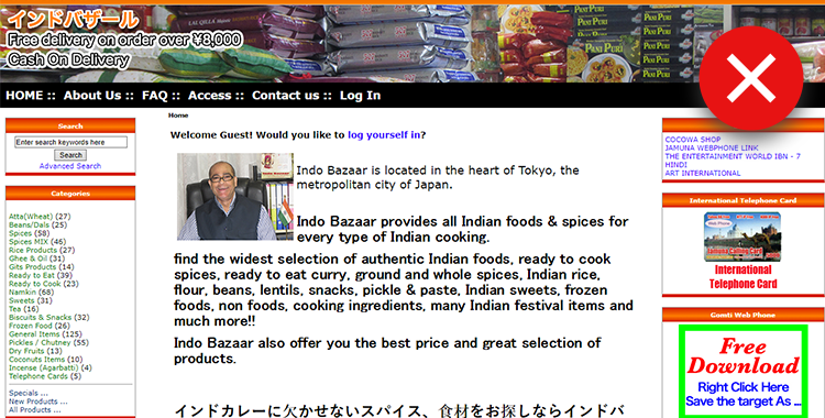
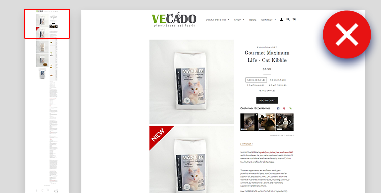
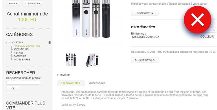
Bad:
To understand what this site is selling, you have to read lots of text carefully. The header image shows only packages - could be virtually anything in here! This is the most common ecommerce design mistakes.
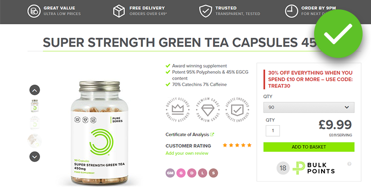
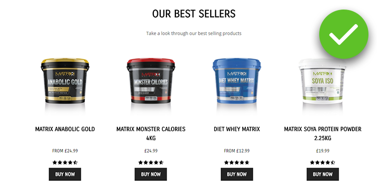
Good:

-
- Ugly pop-ups
On smaller e-commerce stores, pop-ups are usually made with help of apps and extensions. If you use one, make sure you create nice design, dig into in-built settings, follow the basic rules of conversions.
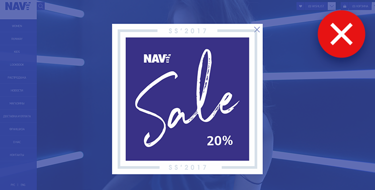
Bad:
It’s hard to read anything on this pop-up, it hides a huge part of the homepage, leads nowhere and suggests no action. Such a bad website design can easily drive visitors away.
Good:
-
- Mobile sticky elements hiding content
Those examples of bad website design fall into two main categories: navigation elements and live chat things. Both should be of correct size and placed carefully, so none of them hides important page information on each other during scrolling.
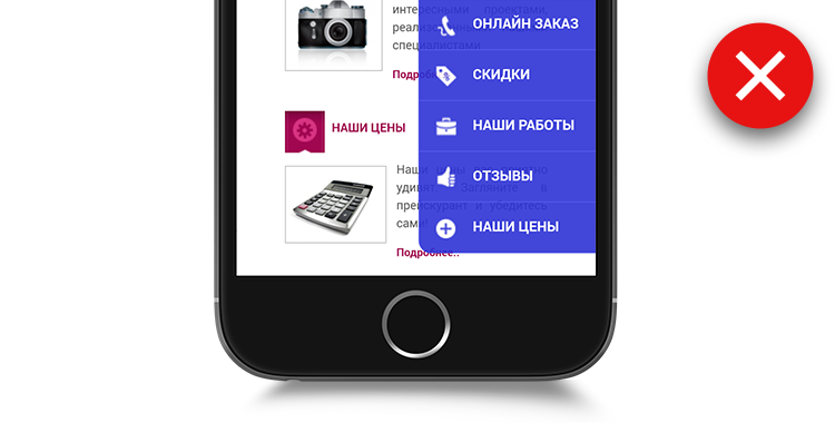
Bad:
Mobile sticky menu blocks everything and won’t hide at all. It’s impossible to use the site correctly.
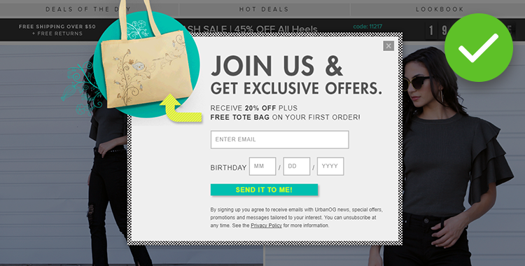
Good:
The live chat icon is small enough, and the navigation header is sticky, but it stays on top and doesn’t interfere with the page content.

-
- Wise usage of space
When you’re planning your product page content grid, always think of how much text you’re going to have inside the blocks, and how the page will look with various amounts of text in each block - because all product descriptions are different in length.
Bad:
The upper right blocks were not meant to contain a lot of text and pictures - this is among widespread ecommerce website mistakes. When you scroll down, there’s a lot of free space to the left, and you have to scroll a lot to reach the end of the description.
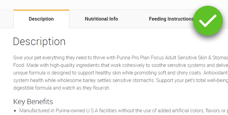
Good:
The text was divided into tabs, it saves space and reader’s time - you can quickly move to the needed section without scrolling. It’s good to place more advanced info to secondary tabs, and the customer will reach it if he needs to without feeling overwhelmed with information.
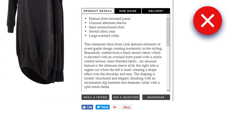
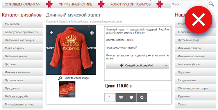
Bad:
This is a little recommendation from me: please don’t do tabs with scrolling! This is one of examples of bad website design that really annoys customers.
-
- Visual and typographic hierarchy
To get this one, you should understand the basic logic of a product page or a category/home page - these are the pages I find such ecommerce design mistakes on.
The main aim of the page is to sell. So, the “Buy” or “Add To Cart” button should be popping out and be of enough size so you could click it easily.
What is more, three main and decision-making parts of product or category page are the product name, the price and images. So these ones must dominate when you look at a page - mostly with size, then with color and contrast.
Bad:
The product page - it’s poorly designed (and the image must be replaced), it could be saved by enlarging the product name, the image, and the add to cart button. These small enhancements will immediately make your page look better.
Good:
Notice that the green buy button is relatively small, but it really stands out because it’s bright, and there are no significant and competing elements of this color on the first screen, too.
-
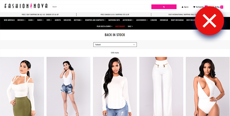
- Weird navigation
Sadly, I often see that store owners do really strange things with navigation menus. Most often, it’s overdoing - adding three or more navigation menus onto a single page.
Bad:
This one has three! The top menu, the left menu with product styles, and the right one with product types. I guess, it was made to let customers choose by different options. Ecommerce world came to to a better solution of the case - layered navigation with filters it is.
Bad:
Another example of overdoing. The number of header menu points is shocking, even though the pictures look attractive, this is one of crucial ecommerce design mistakes.
-
- No retouch of images
Almost always the pictures you take with your camera or phone, especially with not very strong light indoors, look dull and lack contrast. This is concerned to the moment that cameras can’t handle the images the way our eyes and brain understand them.
Professional photographers usually take pictures in RAW format that allows tuning the image. It looks the way you see things in real life (it can be done with other formats, but RAW is the best in this case). What is more, professional retouching includes removing unwanted dust, polishing the edges and the background.
Bad:
The slider shows several pictures of (maybe even nice) products, but the pictures were taken with a mediocre camera and weren’t retouched.

-
- Outlining images
This is a surprising thing that often appears even on cute store designs. Clear and flat minimalistic design now steps out to be best solution for product grids, because it focuses on products. Some site owners continue to add outlining, dividers and boxes in places they aren’t needed. Regarding product images with white or transparent background, it may be a very annoying part of the store design.
Bad:
Outlining images with white background is twice unnecessary. What is more, in this example of bad web design the color of the outlining leaves much to be desired.

-
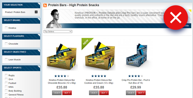
- Small elements in filtered product blocks
This is a very common sin. I don’t know why so many blocks on various platforms and stores have tiny images and text fonts - maybe it’s the legacy of the era where screens and resolutions were smaller. Sometimes it applies to catalog and search pages.
Bad:
This block is very hard to perceive. The text is way too small to read, and the buttons are tiny.
Good:
-
- Small font across the site
Another legacy issue here. It’s much worse when all the texts across the site are so small that you can’t possibly read anything.
Bad:
The lines are too long, the font color doesn’t have enough contrast, and the body text desperately needs enlarging.
Want to level up your e-store?
It takes just a few minutes to try with Cart2Cart - so set up your Demo and get ready for the new look & feel of your e-store!
Start free Demo nowWrapping up
Most of these ecommerce design mistakes don’t seem critical at some point. And maybe smaller businesses don’t have enough time and resources to redesign their sites or just to update them a bit to look smarter.
Thing is, the above mentioned mistakes and examples of bad website design can be very annoying and affect your conversion rates, sales and revenue. It means that sometimes lack of investments can cost you money.
It is very important. More and more sites look crisp, shiny and are comfortable to use. These days, customers have more experience with nicer looking online shops. Now sites are not built from scratch any more, and most of the stores are created on highly-optimized platforms e.g. Magento or Shopify that let merchants achieve better looks with fewer resources, you have more competitors regarding e-commerce design as a sales instrument.

 March 31, 2025


Comment by gate.io
For my thesis, I consulted a lot of information, read your article made me feel a lot, benefited me a lot from it, thank you for your help. Thanks!
Comment by Johnette
I like this post!
I read your blog quite often and you always come up with great stuff.
I shared it on Facebook and my followers loved this!
Go on like that!
Comment by Svitlana Kryskova
Hello Johnette,
Thank you for the inspiring words! We work hard to make our post informative and helpful for our readers. Hope you find other articles great as well. Don’t forget to share the ones you think are the best.
Comment by Nicola Yap
You’ve done a great job here because you actually included concrete examples of all your points, which made it really easy to follow along and agree with you. Great roundup of tips.
Comment by Iryna Namaka
Hi,Nicola,
Thank you for your feedback. We do our best to prepare the most comprehensive materials and it is always inspiring once the job gets appreciation. Thank you for these nice words. We look forward to more comments from you! Don’t forget to share the articles you like most of all)